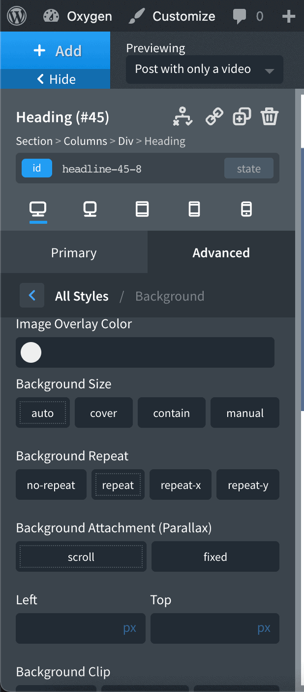
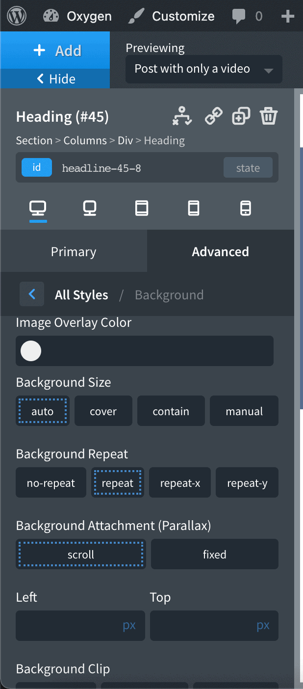
Luciana over in the Facebook group isn’t happy about the low-contrast dotted border around interface elements in the Oxygen editor indicating the active or selected ones.
Before:

Let’s fix this, shall we?
After:

Here’s how:
Step 1
Install and activate Code Snippets plugin.
Go to Snippets > Add New.
Title: Anti-Ant Mode for Luci
Code:
add_action( 'oxygen_enqueue_ui_scripts', 'wpdd_custom_css_oxygen_editor' );
/**
 * Load custom CSS in the Oxygen editor.
 */
function wpdd_custom_css_oxygen_editor() {
	// if this is not an Oxygen editor page, abort.
	if ( ! defined( 'SHOW_CT_BUILDER' ) ) {
		return;
	}

	// if this is the Oxygen's frame, abort.
	if ( defined( 'OXYGEN_IFRAME' ) ) {
		return;
	}

	$css = '
		body .oxygen-button-list .oxygen-button-list-button-default {
			outline: 2px dotted rgba(70,136,200);
		}
		';

	wp_add_inline_style( 'oxygen', $css );
}
Set the snippet to run everywhere. Save changes and activate.
If there is anything else you would like to change in the Oxygen interface CSS-wise, add your custom CSS rules in the above.
Update on January 12, 2021: This has been added as an option under Editor Tweaks module of Oxy Toolbox.