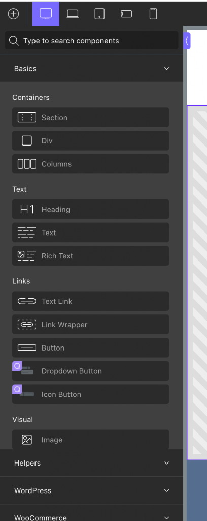
Oxygen 4.0 Beta 2’s Add Elements interface looks like this:

In my opinion that looks like changing something that was working fine and actually better just for the sake of change. I doubt any thought or user research went into that.
If you are looking to revert this to how it was before i.e., a grid of icons instead of a list like this:

add this Code Snippet:
add_action( 'oxygen_enqueue_ui_scripts', 'wpdd_custom_css_oxygen_editor' );
/**
 * Load custom CSS in the Oxygen editor.
 */
function wpdd_custom_css_oxygen_editor() {
	// if this is not an Oxygen editor page, abort.
	if ( ! defined( 'SHOW_CT_BUILDER' ) ) {
		return;
	}

	$css = '
		body .oxygen-add-section-accordion-contents {
			display: grid;
			grid-template-columns: repeat(3, minmax(0, 1fr));
			gap: 10px;
		}

		body .oxygen-add-section-accordion-contents h2,
		body .oxygen-add-section-library-menu,
		body .oxygen-add-section-accordion-contents .oxygen-add-section-accordion-contents {
			grid-column: 1 / -1;
		}

		body .oxygen-add-section-element {
			display: flex;
			flex-direction: column;
			justify-content: center;
			margin: 0;
			height: auto;
			padding: 10px;
		}

		body .oxygen-add-section-element img {
			margin: 0 0 10px 0;
		}

		body .oxygen-add-composite-element {
			overflow: visible;
		}

		body .oxygen-add-section-subsection {
		  margin: 0;
		  grid-column: 1 / -1;
		  width: auto;
		}

		body .oxygen-add-section-accordion-contents h2 {
		  margin-top: 10px;
		}
		';

	wp_add_inline_style( 'oxygen', $css );
}
Set it to run on the front end only.
References
https://wpdevdesign.com/anti-ant-mode-for-luci/
https://css-tricks.com/equal-width-columns-in-css-grid-are-kinda-weird/