
A common design trend nowadays is to have the logo appearing in the middle with menu items appearing to its left and right in the header.
One approach for achieving this is using two different menus but the problem is that then we have to deal with two different hamburger icons and mobile menus.
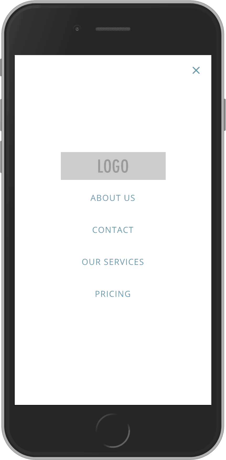
A better way is to set the logo as a background for a “Home” menu item which will be positioned in the middle and then using Flexbox’ order property to show it at the top in mobile menus.
In this tutorial, I share the steps for setting this up in Oxygen.
Step 1
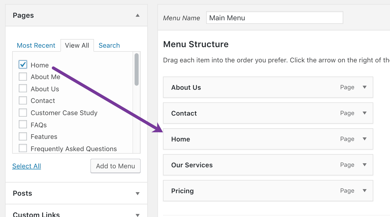
Go to Appearance > Menus and create/edit your menu.
In the Pages section, go to “View All” tab, tick the top-most Home and click “Add to Menu” button.
Drag the Home menu item in the middle.
Step 2
If you have not already, edit your Main Catch-all template and add a Menu element in the Header where you want the navigation to appear.
Step 3
Add this CSS:
.oxy-nav-menu .menu-item-home {
    width: 200px;
}

.oxy-nav-menu .menu-item-home a {
    padding: 0;
    background: url(http://placeholdit.imgix.net/~text?txtsize=100&txt=LOGO&w=600&h=160) no-repeat center;
    background-size: contain;
    text-indent: -9999em;
    height: 100%;
}

body .oxy-nav-menu .current-menu-item.menu-item-home a {
    border-bottom: 0;
    padding: 0;
}

.oxy-nav-menu .menu-item-home:hover a {
    background-color: transparent !important;
}

@media only screen and (max-width: 1120px) {

    body .oxy-nav-menu.oxy-nav-menu-open .oxy-nav-menu-list {
        display: -webkit-box !important;
        display: -ms-flexbox !important;
        display: flex !important;
    }

    .oxy-nav-menu .menu-item-home {
        -webkit-box-ordinal-group: 0;
            -ms-flex-order: -1;
                order: -1;
        margin: 0 auto;
    }

}
Replace http://placeholdit.imgix.net/~text?txtsize=100&txt=LOGO&w=600&h=160 with the URL of your logo image.
Adjust the width value in
.oxy-nav-menu .menu-item-home {
    width: 200px;
}
as needed.
Replace 1120 in @media only screen and (max-width: 1120px) { with the breakpoint at which you have set the menu to collapse into the hamburger.
That’s it!