
Sticky headers are a great solution for giving users constant access to site navigation while scrolling the page. Here’s how we can make the elements inside the sticky header change colour as the user scrolls down to different sections of the page.
This works well on single page websites or on landing pages with large sections with contrasting text.
Note – if you prefer to create using a UI instead of code, this can now be done with OxyPowerPack using the ‘Start overlapping element’ and ‘Finish overlapping element’ events as seen in this video.
Creating the Effect
The effect is created by adding a little bit of jQuery to our sticky header row, which first calculates the positions of all the sections on the page, then toggles classes on the sticky header based on the users scrolling position.
We can then use those classes to target the items inside the sticky header row ( or the header row itself ) to change the colours, or whatever we like, as the user scrolls over each section.
Add Classes to Sections
On our landing page, we first need to decide which sections are ‘dark’ enough that lighter text is needed to provide more contrast. Then we give each of these sections on the page the class ‘dark-section’.
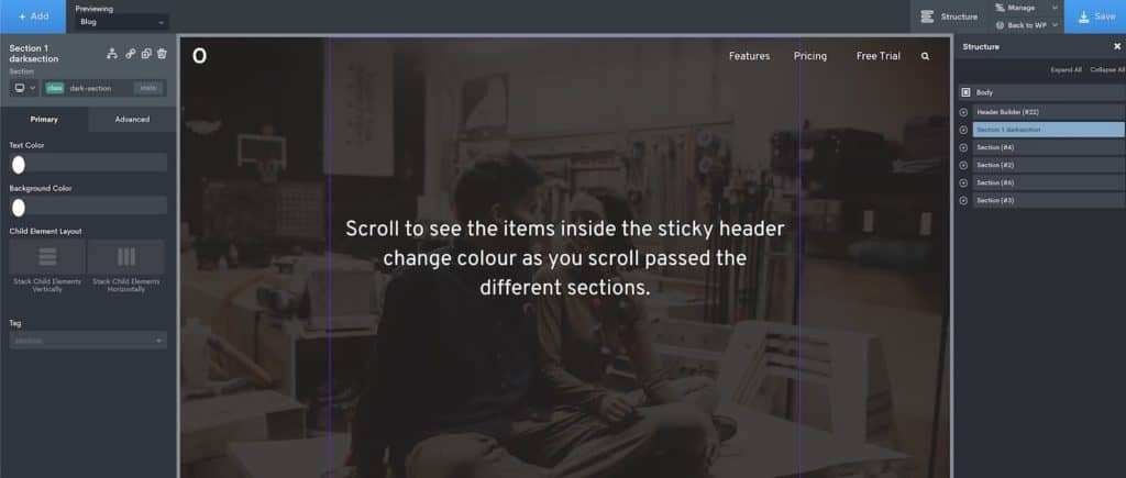
We then do the same for light sections, with the class ‘light-section’.
These classes will add no styles, they are simply there as triggers for the header to change as the user scrolls.
Add Sticky Header
Whichever header row will be sticky needs the class ‘sticky-row’ applied. We’ll be using this to help us target the elements inside, menu, logo, icons etc.
Applying the jQuery
Here is the jQuery we add to our chosen header row that will be sticky;
jQuery(document).ready(function($) {

	"use strict";

	// Define variables
	const headerStickyRow = $('#%%ELEMENT_ID%%'),
		  headerStickyHeight = headerStickyRow.outerHeight(),
		  lightSection = 'light-section',
		  darkSection = 'dark-section',
		  lightHeader = 'light-header',
		  darkHeader = 'dark-header';

	// When user scrolls
	$(window).scroll(function () {

	  // For each section found
	  $('.ct-section').each(function () {

		  // We calculate how we far user scrolled & where the sections are located
		  let scrollTop = $(window).scrollTop(),
			  offsetPosition = $(this).offset().top - headerStickyHeight;

		  // As user arrives at each section
		  if (scrollTop > offsetPosition) {

			// Change classes based on if the section is light or dark
			if ( $(this).hasClass(lightSection) ) {
				  headerStickyRow.addClass(darkHeader);
				  headerStickyRow.removeClass(lightHeader);
			} else if ( $(this).hasClass(darkSection) ) {
				  headerStickyRow.removeClass(darkHeader);
				  headerStickyRow.addClass(lightHeader);
			}

		  }

		});

	});

});
Adding the Sticky Header Styles
The actual CSS will be unique for different types of headers, but we’ll go through some examples.
The general idea is that as the sticky header passes over a dark section, it will be temporarily given the class ‘light-header’.
Likewise, as it passes over a lighter section, it will be given the class ‘dark-header’ instead.
These dynamically added classes give us the freedom to then change whatever we like in the sticky header for each dark or light section just using CSS.
Note – If the first section of our page is dark, it’s best to add the light-header class to the sticky header row ourselves. This way the correct class will be already there when the page first loads.
Some Examples
We first need to make sure none of the colour settings in our header have been styled using IDs, otherwise the CSS may struggle to override it.
For the menu items, we need to make sure no colour is selected at all, just the word ‘inherit’ is applied where we’d usually have our hex colour. For the hover state style, we can choose any colour as normal.
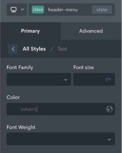
This then allows us to change the menu text colour from light to dark without having to worry about our CSS overriding any applied menu hover styles.
Here is the CSS we apply to our stylesheet to make sure the menu items are changing colour correctly as the user scrolls.
.oxy-header-row.light-header .menu-item {
  color: #fff;
}

.oxy-header-row.dark-header .menu-item {
  color: #111;
}
For logos, if we’re using inline SVGs which, say, has a class ‘logo’, it’s easy to make our logo change also by targeting the colours in a similar way;
.oxy-header-row.dark-header .logo path {
  fill: #111;
}

.oxy-header-row.light-header .logo path {
  fill: #fff;
}
If we are using an icon component in the header, say for a search icon with the class ‘search-icon’, then we’d use this.
.oxy-header-row.light-header .search-icon {
    color: #fff;
}

.oxy-header-row.dark-header .search-icon {
    color: #111;
}
As you can see it’s quite flexible, you can get as creative as you want with it and apply to any elements in the header.
Another Option
If our menu items are centered or if there are a lot of them, there might be a problem with the menu items overlapping the main content of the site. In which case, a background colour will be needed on the header row to keep everything visible.
We can still use this same technique to get a similar effect, with the background colour changing also see example video.
For this, we’d target the sticky header itself;
.oxy-header-row.dark-header {
  background: #111;
  color: #fff;
}

.oxy-header-row.light-header {
  background: #fff;
  color: #111;
}
All done
As with lots of scrolling type effects, this is probably something that makes sense only on desktop. For mobile, I’d turn off the sticky header in the Oxygen settings.