When using Gutenberg for writing posts on Oxygen sites, some of the features such as wide alignments for blocks aren’t activated by default. They need to be turned-on at a theme-level. As themeless Oxygen users, we can activate them and add some styling to fit our single post templates.
Activating the Wide Alignments
The code to add the functionality for wide alignments inside the editor is the following;
add_theme_support( 'align-wide' );We can either add using code snippets plugin or inside our custom plugin, it doesn’t matter.
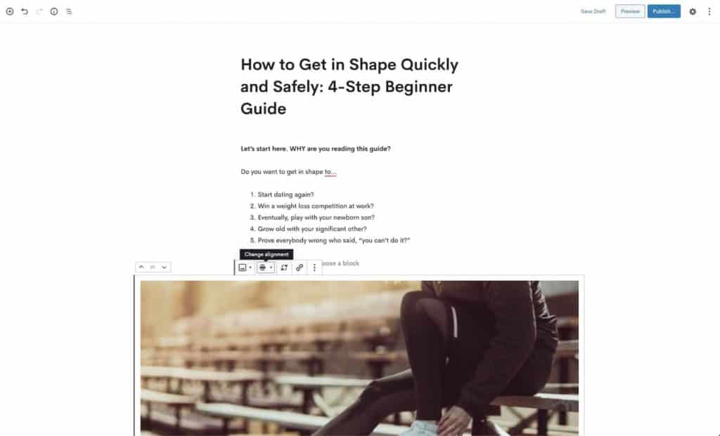
Once added, there will be two new alignments for blocks found inside the post editor. Named ‘wide width’ and ‘full width’. Wide width shown below, full width spans the whole viewport.

Styling Our new Alignments
The wide alignments will work out of the box while viewing the post inside the editor, but they won’t yet be doing anything on the front end.
We can add some styles to our Oxygen site to make the alignments work well with our post layouts.
The CSS needed will depend on our post template, but we’ll look at two main types of post layouts where these new alignments seem to make the most sense. Boxed and full width (without sidebar).
Oxygen Single Post Template
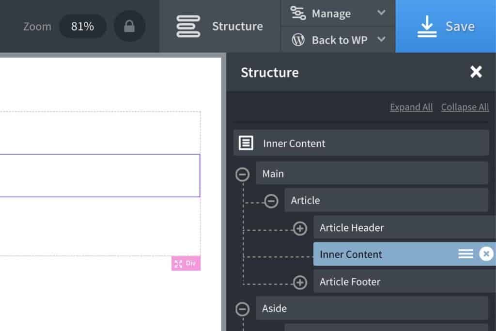
For a basic single post template in Oxygen, the structure will look like something like this;

The article header (title, post meta) can be created with Oxygen elements pulling in the dynamic data. The post content is an inner content component, which pulls in the blocks from Gutenberg.
Full width Template
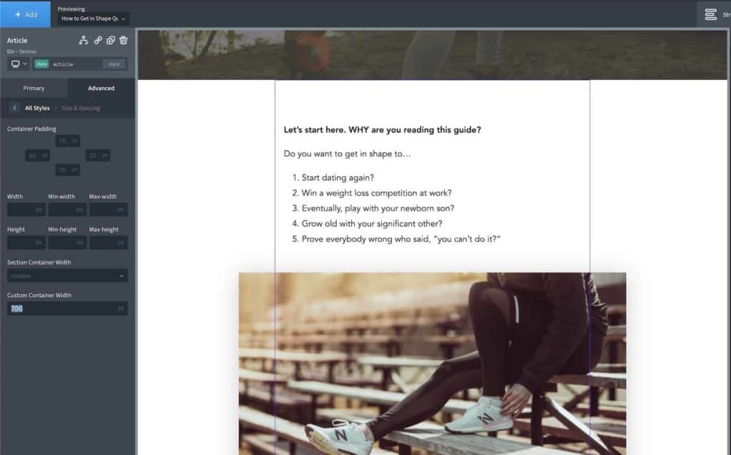
With a full-width layout type, the post content has no border and looks similar to how the post looks inside the editor.

For this layout, the inner content would be inside a section, with a custom container width ensuring there aren’t too many words per line (700px shown). We want the wide blocks to break-out of that 700px container using negative margins & increasing max-widths.
Here is the CSS to add to our stylesheet in Oxygen for this layout type;
@media screen and (min-width: 992px) {

    .single-post .ct-inner-content .alignfull {
        margin-left  : calc( -50vw + 50% );
        margin-right : calc( -50vw + 50% );
        max-width    : 100vw;
    }

    .single-post .ct-inner-content .alignwide {
        margin-left  : -100px;
        margin-right : -100px;
        max-width    : 900px;
    }

}
Notice we’re using a min-width media query to ensure the smaller screen sizes aren’t affected.
Top & bottom margins can also be added to give these larger elements more breathing room away from the text content. This will be depending on our typography styles. For a guide, 2em or 3em could be used. (using em so the margin is automatically reduced if the font size is reduced)
Boxed Template
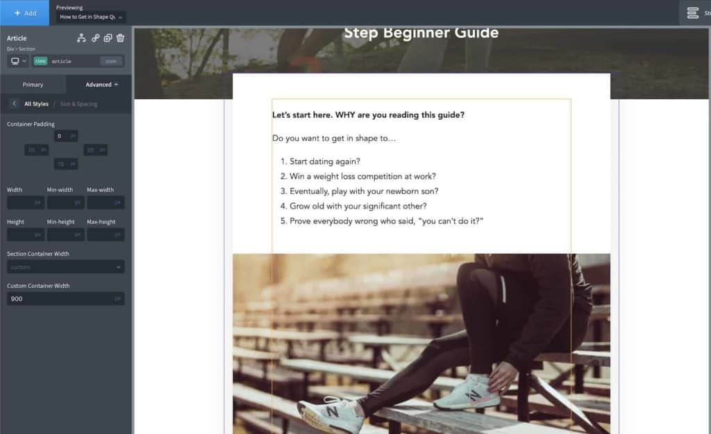
With a boxed template, the post content has an edge, usually either a border or box-shadow separating it from the rest of the site. The section will have a wider width to allow for the content padding (giving us the same words-per-line as before)

For this type of layout, align-full doesn’t make sense to use as it would look awkward, but align-wide can be used to span the entire width of the container. This is common on food blogs, for example, where the focus is the images.
Unfortunately, there isn’t a way yet to only activate just the wide alignments and not the full, so to make sure content editors don’t break the boxed layout we can just apply the same styles to both.
The important thing here is to make sure the negative margins are the same as the container padding & the max-width equals the container width.
eg if our post content section width was set at 840px and it had 70px padding around the content (giving us the same 700px text width as before), this would be the CSS needed to apply the wide alignments;
@media screen and (min-width: 992px) {

    .single-post .ct-inner-content .alignfull,
    .single-post .ct-inner-content .alignwide {
        margin-left  : -70px;
        margin-right : -70px;
        max-width    : 840px;
    }

}
Again, adding margin-top & margin-bottom would be useful to add more space, depending on the typography of the site.
Updating Images Sizes
As there will be now be larger images inside our posts, we then need to change our default image sizes in our media settings to ensure the correct widths are being used. Then regenerate thumbnails to prevent existing images to be blurry or stretched if working with existing content.
All done.
Now on the front end, we have our alignments working as expected and content editors get to use some of the new WP functionality for displaying their content in more dynamic ways.