In this tutorial we’ll walk through the process of building a custom off-canvas element, triggered by an animated burger style toggle button in Oxygen. We’ll be using OxyPowerPack’s Interactivity Engine to set the trigger & toggle classes to change elements when the user clicks.
The main purpose of this tutorial is not so much about the final layout, it’s more to show how to make an event (a click on a specific element) trigger style changes across multiple other elements. In this case, to reveal an off canvas element in an interesting way.
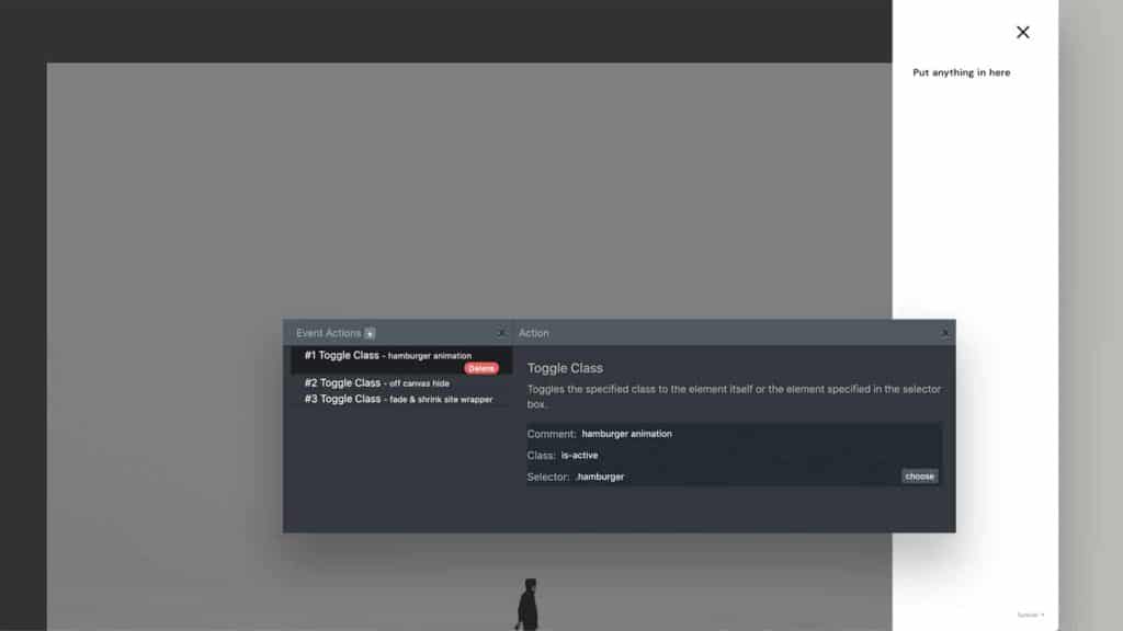
Of course, this was always possible with code in Oxygen, but now it’s a bit simpler, thanks to OxyPowerPack and can be done much more visually and without adding any custom code.
Toggling Classes
All the elements are animated by just toggling specific classes. Toggling a class means dynamically adding or removing a class. If the class is already found on the element it will be removed, if it’s not found then it will be added.
Adding / removing classes is the key to turning styles on / off for elements, which is a common way to make elements reveal and hide.
Why are we not just using the Modal for this?
The modal element already comes with the ability to set a click as a trigger and can act as an off canvas by adding a slide animation, but it’s not going to work for this for a few reasons;
- We need more control over how the elements are revealed
- There are multiple elements being animated
- We want an animation on both open & close
- No backdrop needed
- We want control over the transforms and transitions.
Like with creating anything manually instead of using a pre-built component – there are more steps, but the benefit is that we get full control and it’s actually really simple and easy to customise.
Apart from initially adding the burger toggle, which requires pasting in some HTML, there is actually no code needed at all.
These are the six steps;
- Set up the structure in a new template
- Create the burger toggle button (using hamburgers.css)
- Build the off canvas element
- Set up our transitions
- Add new classes for our ‘hidden’ styles.
- Use OxyPowerPack to set the trigger for the class changes
1. Set up the structure in a new template
To make things more modular, we can create a brand new template for our main template to inherit. This way our entire site can be contained inside a site wrapper. We just need to ensure our new template is set to catch all and has a higher priority than the main template.
The structure needs to be as follows;
- Code Block (this will be for the trigger, we’ll give class ‘off-canvas_trigger)
- Div (this is for the off canvas element, we’ll give class ‘off-canvas’)
- Div (this is the site wrapper to hold the inner content, we’ll give class ‘site-wrapper’ and set the width to 100%)
Note – It can be simpler to leave the inner content element out until right at the end, so we’re only focusing on the three elements that we currently care about.
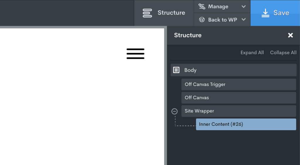
For logged in members, you can get access to the template with the Interactivity Engine settings already set up below..
2. Creating the burger toggle button
The burger toggle is the part that requires a bit of html/css, but we’re just pasting it in from the Hamburgers.css site.
Inside the code block the html needed for the burger toggle is this
<button class="hamburger hamburger--slider" type="button">
  <span class="hamburger-box">
    <span class="hamburger-inner"></span>
  </span>
</button>
Next we need to add the CSS that comes with the hamburger menu button. The easiest way is to add a new stylesheet inside Oxygen and paste in the hamburger CSS found here.
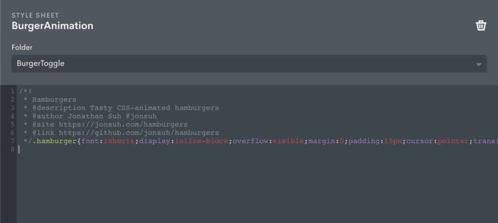
The burger toggle menu will now be visible inside the code block.
The code block just needs to be fixed positioned into the top right of the viewport. That’s all we need to do with that for now.
3. Building the off canvas element
The off canvas element is the first div after the code block with the class ‘off-canvas’.
We need to add the basic styles to position it correctly. This is giving it a fixed position to the right side of the viewport from the top to the bottom of the screen (top: 0, right: 0, bottom: 0) and a high enough z-index so it sits above other elements.
It will also need a background colour and a width set, say 400px. and a max-width to make sure it’s responsive. We set the max-width to 85% so it doesn’t quite cover the entire viewport.
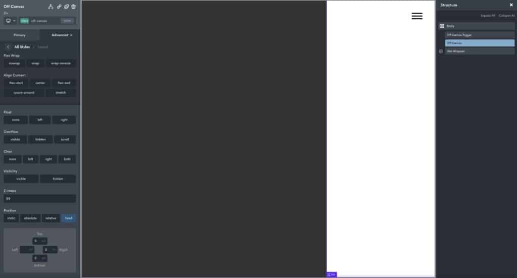
We can then add any elements we want inside of the off canvas element and add any other styles we like such as padding to get the spacing we need.
The element will remain fixed in this position until we start adding new classes to hide it later. For now, we’re positioning and styling the element how we want it to look once it has been revealed.
3. Setting the transitions
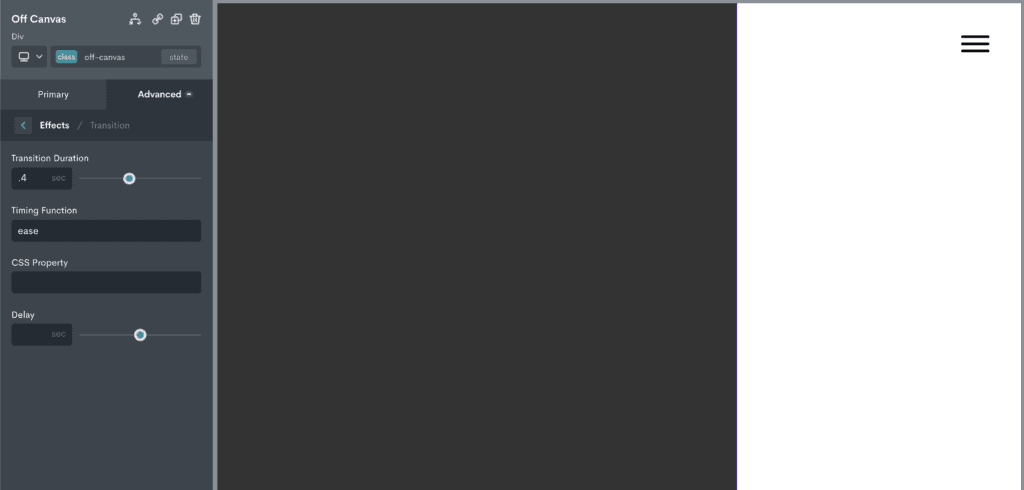
For consistency, we want both the site-wrapper and the off-canvas elements to have the same transition times so they are synchronised when the toggle button is clicked.
In the demo, both these elements have a transition duration of ‘.4s’ and a timing function ‘ease’. We could also to choose to add a delay if we wanted them to be slightly out of sync.
Add new classes to add our ‘hide’ styles
We can now add new classes to both of our elements to add the effect. These are the classes that will be dynamically added when the user click on the burger toggle button. The styles added to these classes will just be for creating the effect, just transforms and opacity.
For the off-canvas element
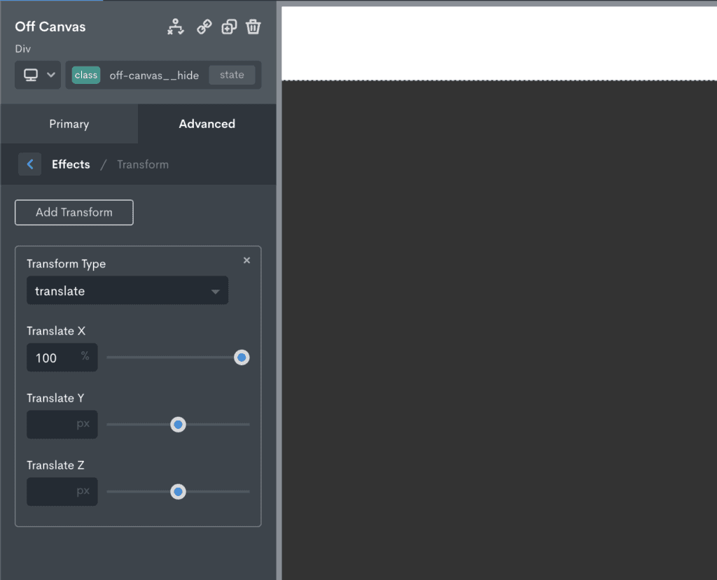
The off-canvas is currently visible, so we need to add a class that hides it.
Let’s add the class ‘off-canvas__hide’ and add a transform with 100% in the X-axis to completely hide the element off to the right of the viewport.
For the site-wrapper element
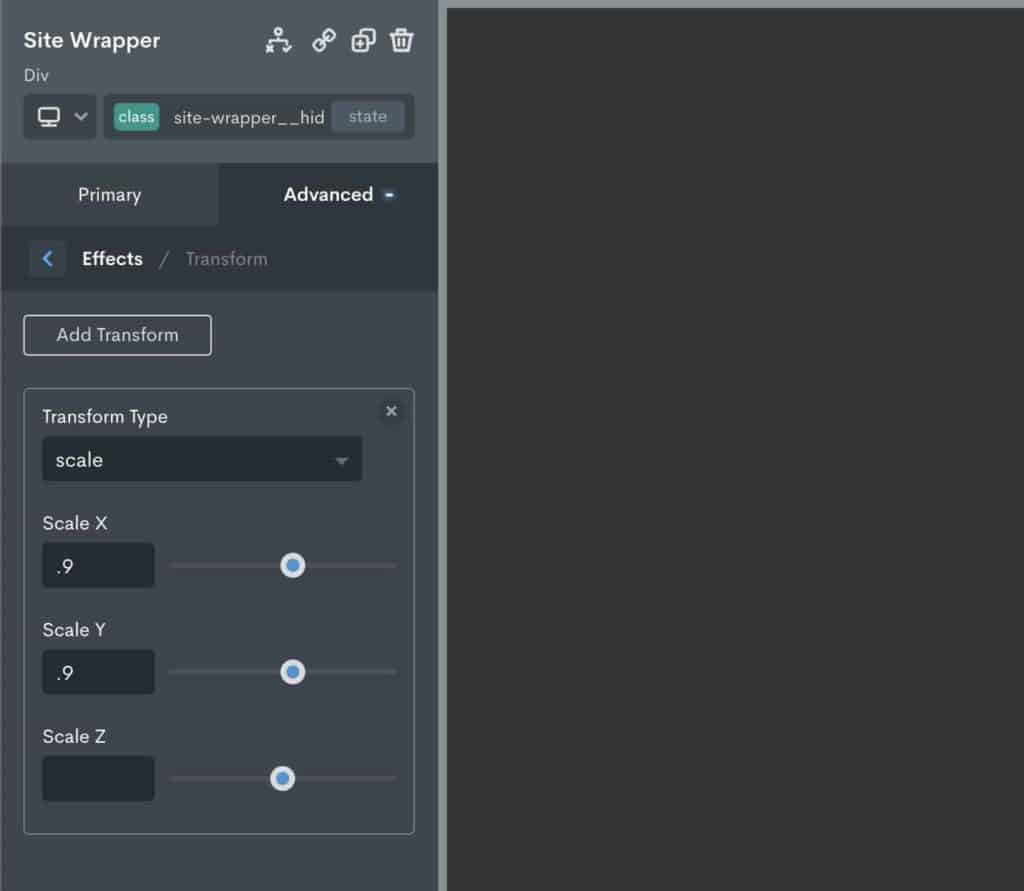
The site wrapper will also need a new class that creates the wanted effect. In our case, this is to make it fade & appear to recede into the distance.
To keep things easy to remember, let’s add a class ‘site-wrapper__hide’ to add the styles for what we want it to do.
In the demo, we scaled the element using a transform down to 0.9 and also reduced the opacity down to 0.4.
Note – If anymore styles need to be added to the elements that aren’t part of the effect, then the elements must have their original classes selected before applying the styles.
Use OxyPowerPack to set the trigger to apply the classes
Now all the styles have been added for the effect, the last part is to make sure that clicking the code block (containing our burger toggle) triggers the needed class changes on all the elements, forcing the new styles to kick in.
With OxyPowerPack active and docked at the bottom of the builder. Clicking the code block will reveal the settings to select our action. (if unfamiliar with how events and actions work, see our Interactivity Engine guide)
We’ll choose ‘click’ from the available list of actions, then click the + symbol to add the event actions.
There are three different actions to setup. All are Toggle Class.
Toggle Class Action Settings
Hamburger animation
With the burger toggle, we’re just adding the ‘is-active’ class to the hamburger (this is a class required to make the hamburger animate)

Off Canvas
With the off-canvas, we’re toggling our new class that we set up the transform on.

Site Wrapper
With the site-wrapper, we’re toggling our new class that we set up the scale and opacity on.

The very last step is just removing the .site-wrapper__hide class from the site-wrapper element using the class drop down. This is because, unlike the off-canvas element, we don’t want the site-wrapper to be in it’s ‘hidden state’ when the page first loads.
All done
This approach is quite flexible for creating any type of effect that involves changing styles when an element is clicked. It’s just a case of thinking about which style needs to be added to create the effect, adding a new class to apply those styles, then toggling that new class on and off with an event, like a click.