In this guide, we’ll go over some information on SRCSET images in WordPress, how to use them in Oxygen & how they can be used when we’re creating & using custom image sizes.
Responsive Images in WordPress
Responsive Images were added natively to WordPress a few years back & support was added for them in the Image component in Oxygen in v2.2. There are lots of resources explaining how these SRCSET image sizes work in general, but here’s a very simple overview of how it specifically works in WordPress…
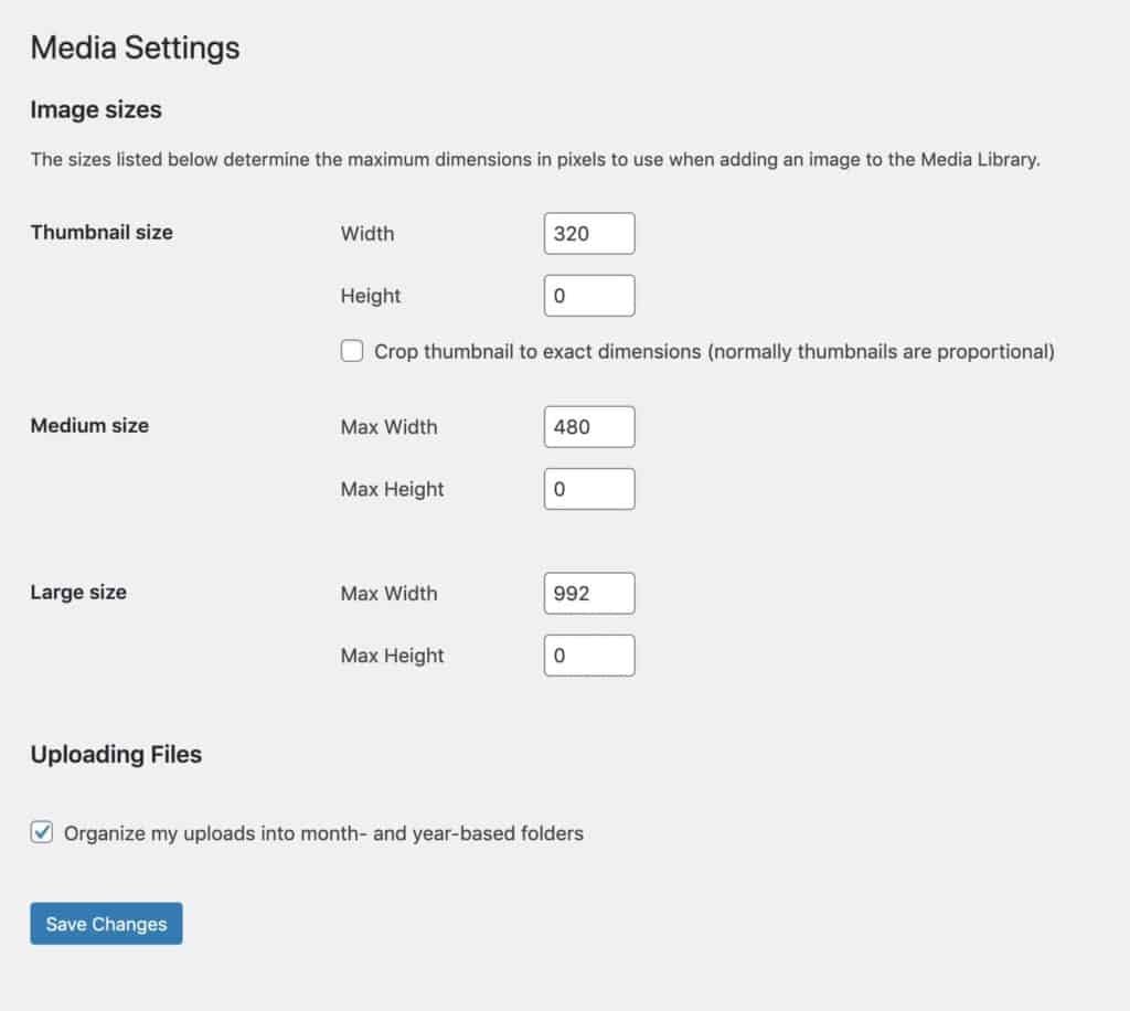
When you add images to the media library WordPress automatically generates multiple copies of that same image at different sizes, Large, Medium-Large, Medium & Thumbnail.
These sizes can all be customised from the media settings and we can also add as new, custom sizes (explained at the end of the post).

When an image is added to the content of a post or page, we choose the biggest size needed depending on the container size. Any smaller versions of the image found with the same aspect ratio will also automatically be added into HTML for us.
The browser can then determine which is the best size to use, depending on what device the user is on. This means smaller devices only download smaller images.
The Easiest Way to Use in Oxygen
Similar to the post editor, when adding images from the image library with the image component, Oxygen will automatically attempt to add SRCSET images to the markup for us.

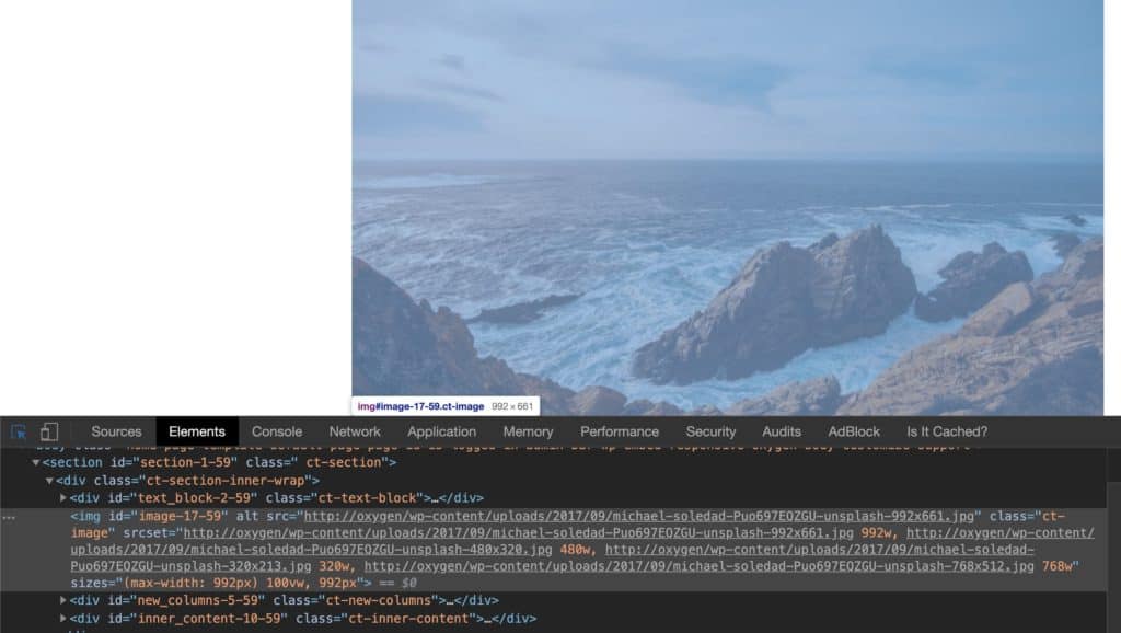
Here we have a container of 992px with an image inside of it. The ‘large’ size has been selected to be used, which is 992px.
What we see in the markup is our large image (992px) being displayed for desktops, the medium large image (728px) automatically created by WordPress, our medium image (480px) and our thumbnail image (320px).
This means it’s working as it should. All of these image sizes have been added to the HTML because they are smaller versions of the image with the same aspect ratio as the large image.
This is working well out of the box because we’re only setting the widths for our image sizes, we’re not setting any heights. Meaning there is no image cropping so by default all images have exactly the same aspect ratio.
Another Example
Let’s say we have a container in a template with a maximum width of 600px on desktop screens. It could be a thin blog post or maybe a column in a wide page layout.
For any images inside this container (or other containers of the same width), we know we want the image to have a width of 600px. Any less and the image will be blurry when it’s made to fit the container with CSS. Any more and then we’re going to be adding unnecessary weight to the page.
If this 600px is a common enough size on our site, like it would be if this was the width of a blog post. Then we could change one of WordPress’ default image sizes to that width and use that. We could make, for example, the ‘large’ size have a width 600px instead of 992px. Alternatively, we could also create a new image size, which we’ll go through below.
As long as we don’t set a height for any of our image sizes, we can then be sure that only the smallest size needed will be downloaded for different screen sizes.
The markup would then have our 600px image for desktop, but also include the smaller sizes of 480px and 320px.
If we are Setting Heights
Sometimes it maybe necessary to set the height as we need the cropping for some reason. The same rule for SRCSET is still true. The smaller image sizes will only be included in the markup if they have the same aspect ratio.
This can make things more tricky when setting heights.
Let’s say we need square images and are creating a custom image size that is a 800×800. In order for any smaller image to be used for mobiles, there would also need to be smaller images that are also squares.
Here, the default size of 320px width we have set for the thumbnail size may not work if the height of the image isn’t also exactly 320px, which it won’t be unless the original image was also a perfect square.
Adding Custom Image Sizes
Adding custom images sizes to Oxygen sites is done the usual WordPress way, but using a code snippets plugin instead of adding code to a theme.
This is how we create a new image size ‘blog-large’ with a width set at 600px.
// Add new image size with width set at 600px
add_image_size( 'blog-large', 600 );
If we wanted to add a square image, we’d set the height and the width and set the cropping to ‘true’. (other parameters are available for more control over the cropping)
// Add new image size with width 600px & height 600px (true for hard cropping)
add_image_size( 'medium-square', 600, 600, true );
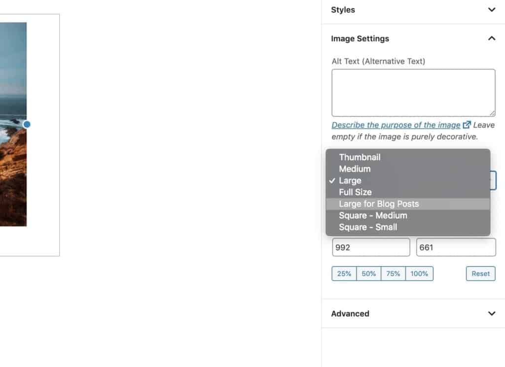
If we needed these new image sizes to be included inside the dropdown in Gutenberg, we can add them into the dropdown list and give it a friendly name;
// Add our custom sizes to list of default image sizes
add_filter( 'image_size_names_choose', 'lit_merge_images_sizes' );
function lit_merge_images_sizes( $sizes ) {
    return array_merge( $sizes, array(
        'blog-large' => __( 'Blog Large' ),
        'medium-square' => __( 'Square - Medium' ),
    ) );
}
They are then available for content editors to choose from when inserting images into a post.

Selecting Custom Image Sizes in Oxygen
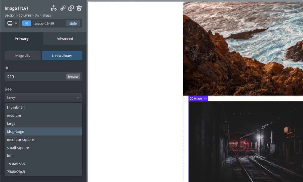
We can also use our custom image sizes in Oxygen when using the image component inside the size dropdown.

If we don’t see our custom size in the dropdown, it means the current image being selected doesn’t have an image generated at that size. In which case, we can regenerate thumbnails first, then go back into Oxygen. This dropdown list is dynamic and is based on what sizes have been generated.
If it’s not Working
If there are no smaller images appearing in the markup on the front end of the site, it’s because there are no smaller images with the same aspect ratio being found. Regenerating thumbnails will generate the needed image sizes for images already in the media library. If setting heights, it’s likely that more custom sizes will need to be manually created to ensure there are images that can be used at those widths.