Scroll snapping is basically the browser locking the viewport to certain positions as the user finishes scrolling. It can be useful for sections that are the exactly 100vh in height to guide the user down the page or for more control over horizontal scrolling inside of sections.

Note – Although scroll snapping in CSS has been around since 2016, browser support is only just hitting the 90% mark. Usually, I would consider this to be a bit too low to write a tutorial, but scroll snapping is more of an enhancement as it isn’t actually changing any of the visual layout.
The users on older browsers will just scroll as normal and not realise anything is different. If you do need more browser support for this type of effect, use FullPage.
A Quick Description of the Scroll Snap Types
In the live demo for vertical scrolling, you can toggle these to see how they work. Scroll snapping can be set to be either mandatory or proximity.
Mandatory
This is the more aggressive type where the scroll snapping is always forced. Whenever the user stops scrolling the browser automatically will take them to the next snap point. In my opinion, this works well only for either horizontal scrolling or when full-page sections are exactly 100vh in height and there isn’t much content in each section.
I don’t recommend using Mandatory if the section heights are bigger than the viewport. It feels like scroll jacking as the user may feel they are no longer in control as they scroll. (To see what I mean, scroll down the demo in mandatory mode to the 70vh section, then scroll back up slightly to view the bottom part of the 150vh section.. annoying isn’t it?)
Proximity
This is much less aggressive. Only if the user stops scrolling near a snap point (within a few hundred px) will the browser take them to the closest snap point. Otherwise, it’s just the usual scrolling experience.
Vertical or Horizontal
As mentioned earlier, and seen in the demo, as well as applying vertically on sections of the page, scroll snapping can also be used inside a specific container for horizontal scrolling similar to flicking left/right in a mobile slider.
Applying Scroll Snapping to Sections
Let’s assume we have a header, a number of sections and a footer. It doesn’t actually matter if the sections are inside a div, or an inner container or are direct children of the body element. The markup doesn’t matter, only the position of the sections on the page matters.
Here is the CSS needed to apply this in Oxygen – To use on only one page, we can add the CSS to a code block on that page instead of inside a stylesheet.
html:not(.ng-scope) {
  scroll-padding: 70px 0 0 0; /* Height of sticky header */
}

html:not(.ng-scope),
body:not(.oxygen-builder-body) {
   scroll-snap-type: y mandatory;
   scroll-behavior: smooth;
}

.ct-section,
.oxy-header {
  scroll-snap-align: start;  /* Set snap alignment to top of section */
}
Notice that we’re setting the scroll-snap-type & scroll-padding directly on the HTML and Body elements. This is to make the whole HTML document our scroll container. The scroll-padding will need to match the height of our sticky header if there is one.
If we wish to remove for smaller screens;
@media (max-width: 1120px) {

    html:not(.ng-scope),
    body:not(.oxygen-builder-body) {
       scroll-snap-type: none;
    }

}
Applying Horizontal Scroll Snapping inside a Section
This is probably the most useful use case. Allowing users to quickly flick through galleries or featured content and ensuring items always align correctly without having to use a slider.
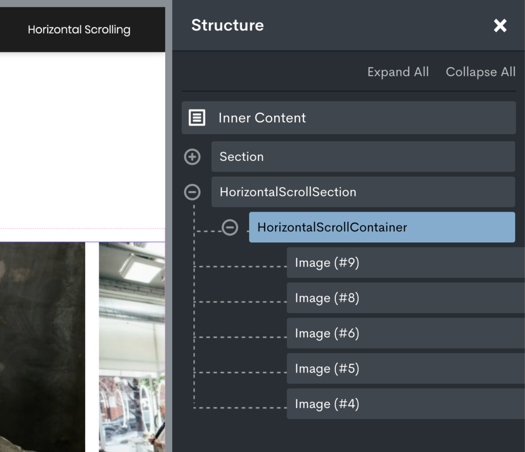
The structure will need to look like this, a div inside a section with the scrollable elements inside that div.

The section can be given the class ‘horizontal-scroll-section’ and the div inside the class ‘horizontal-scroll-container’. For the full-screen layout in the demo, the section width is set to full width instead of page width with all the padding set to zero.
Then this is the CSS we add to our code block or stylesheet;
.horizontal-scroll-section {
    overflow-x: auto;
    scroll-snap-type: x mandatory;
}

.horizontal-scroll-container > * {
    scroll-snap-align: center;
    max-width: 85vw;
}
The width of 85vw on the elements ensures the user can see some of the next element in the viewport, making it obvious that they can scroll horizontally.
All done
As you can see, scroll snapping in CSS is obviously more limited than what we are able to do with something like the FullPage js library. It’s actually a completely different thing. There are no active states and creating dynamic pagination dots etc would require custom jQuery. So we may as well just use the JS library if we needed that.
But if you’re just needing the scroll snap feature then you don’t get any more lightweight than adding just a few lines of CSS instead of a whole library.