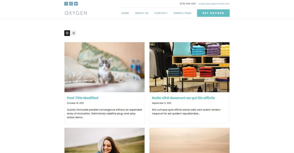
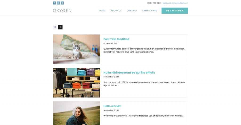
This members-only tutorial provides the steps to set up Grid View and List View buttons on the posts page (blog posts index) in Oxygen.
We shall set it up such that
- posts will appear in grid view (2 columns) by default on the first page load.
- clicking on the List View button will add a
listclass to the posts container. Using CSS we format the posts to appear one below the other. - clicking on Grid View button will remove the
listclass from the posts container. - browser's localStorage is used via JavaScript to set and get the user selection. This way the chosen view will remain and work even on paginated pages as well as when the browser is closed and upon revisits.
- tooltips are shown for the toggle buttons.
- toggle buttons are hidden at a lower breakpoint (< 768px). On smaller screens posts will appear one below the other with each post in layout corresponding to the user's active view (grid by default).
Grid View:

List View:

This technique can be implemented on category and other archive pages as well.
Step 1
If you have not already, set up the posts page by following this tutorial.
Step 2
Let's define a custom image size for the images in the posts page.
Install and activate Code Snippets plugin.
Go to Snippets > Add New.
Title: Custom image sizes
Code:
add_image_size( 'post_image', 800, 500, true );Set the snippet to run everywhere. Save changes and activate.
Create another snippet for excerpt length.
Title: Custom excerpt length
Code:
This is a premium members-only content.
To view the rest of the content, please sign up for membership ($47/month or $599 one-time).
Already a member? Log in below or here.