Oxygen Mobile Menu Customizations

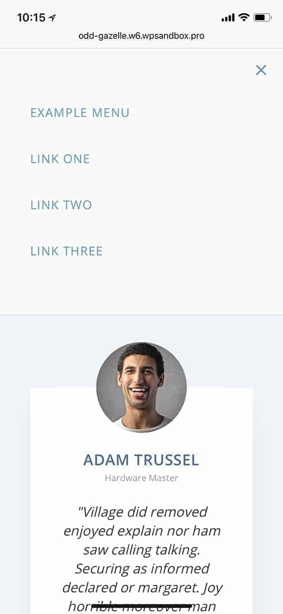
This tutorial provides the CSS code to set auto height for the mobile menu (vs the default full screen) in Oxygen.

Add this CSS:

/* Mobile Nav */

@media only screen and (max-width: 768px) {

    body {
        position: relative;
    }

    .admin-bar .oxy-menu-toggle {
        top: 66px;
    }

    .oxy-nav-menu {
        transition: all 0.35s ease;
    }

    .oxy-nav-menu.oxy-nav-menu-open {
        display: block;
        bottom: auto;
            background-color: #fafafa;
            border-bottom: 1px solid #ddd;
    }

    .oxy-nav-menu.oxy-nav-menu-open .oxy-nav-menu-list .menu-item a {
        justify-content: flex-start;
    }

    .oxy-nav-menu.oxy-nav-menu-open.oxy-nav-menu-responsive-dropdowns .menu-item .sub-menu {
        padding-left: 20px;
    }

    .oxy-nav-menu.oxy-nav-menu-open .sub-menu .menu-item a {
        padding-top: 0 !important;
    }

}

Change 768px to the width at which your regular nav collapses into a mobile menu.

Bonus:

If you want the hamburger menu icon to be fixed and always be visible, add the following additionally inside your media query (768px in the above example):

.oxy-menu-toggle {
    position: fixed;
    top: 20px;
    right: 20px;
    padding: 10px;
    border: 1px solid #6799b2;
    border-radius: 2px;
    background-color: #fff;
}

.oxy-nav-menu-open .oxy-menu-toggle {
    position: static;
    border: none;
    padding: 0;
}

.oxy-header-wrapper {
    position: static;
}

.oxy-header-container,
.oxy-nav-menu-prevent-overflow {
    height: auto;
}

Posted

in

,

by

Tags:

Comments

4 responses to “Oxygen Mobile Menu Customizations”

  1. Roy Hornsby Avatar

    Hi Sridhar

    thanks for your great tutorials

    I’ve followed this tutorial and everything works as it should. However there are 2 questions I have.

    You don’t say specifically where to place the CSS so I added a code block to the menu and placed it there. As I said it works but was I placing the CSS in the correct way?

    The one problem I have with this is that the hamburger menu, which I’ve displayed permanently, disappears behind a slider I have at the top of the page and reappears when the page has scrolled down far enough. I’m guessing it’s an index issue but do you have any idea how I can fix this? The slider is Smart Slider 3 plugin

    cheers – Roy

  2. Roy Hornsby Avatar

    Hi again

    It’s ok now, just added z-index: 1; into your CSS

    cheers

  3. Steve Cummings Avatar
    Steve Cummings

    Hi, this is great and I really appreciate your post, I was looking high and low for a simple solution to styling the mobile menu, is there a way to make only the top level items bold?

Leave a Reply to Steve Cummings Cancel reply

Your email address will not be published. Required fields are marked *